
Chapter 17 - Population
Demography is the scientific study of population growth and change. Everything in society influences demography and demography conversely influences everything in society. After World War II, the United States began to recover from the long-term negative effects of the war. Families had been separated, relatives died or were injured, and women who had gone to the factories then returned home. For about 4 years the government had assumed war time powers, goods and services were rationed. This assumption of power limited the civil rights of the average citizen. It was an era of social and cultural upheaval.
The year 1946 reflected the impact of that upheaval in its very atypical demographic statistics. Starting in 1946 people married younger, had more children per woman, divorced more often, then many divorcees remarried again, and kept having one child after another. From 1946 to 1956 the birth rate rose and peaked, then began to decline again. By 1964 the national high birth rate was finally back to the level it was at in 1946. All those millions of children born from 1946-1964 were called the “Baby Boomer Generation.” Why was there such a change in family-related rates? The millions of deaths caused by the war, the long-term separation of family members from one another, and the deep shifts toward conservative values all contributed. The Baby Boom had landed. And after the Baby Boom Generation was in place, it conversely affected personal and larger social levels of society in every conceivable way
The Formula
In this chapter you will learn how financial, educational, spiritual, cultural, and emotional social forces shape and form the demographic trends within a society. You will also get a glimpse of how demographic forces shape a society. The core of demographic studies has three component concerns: births, deaths, and migration. All of demography can be reduced to this simple formula called the components of change method:
(Births-Deaths) +/- (In-Migration - Out Migration) = Population Change.
This part of the formula, (Births-Deaths) is called Natural Increase, or all births minus all the deaths in a given population over a given time period. The other part of the formula, (In-Migration) - (Out Migration) is called Net Migration, which is all the migration in minus all the out-migration in a given population over a given time period. Population Change is then added to a previous year's population to yield new population estimate. Most official population counts are estimates. There are mistakes in counting that render results that are very close, but never perfectly accurate.
Let's consider how we might use this formula to measure US population change between 2008 and 2009, using the US Census Enumeration, or the formal counting/estimating of a population by its government. I want to show you how this works using data that is a bit older and is based less on estimates and likely to no longer be revised. Based on the US Census, the 2008 US population was 304,375,000 (retrieved 21 May, 2014 from SOURCE). If you start the estimate with the 2008 population, you can run the numbers through the formula and derive an end of year 2009 population estimate.
In 2008 there were 304,375,000 in the US. There were also (4,263,000 births minus 2,486,000 deaths= 1,777,000 Natural Increase). Add to that a (Net Migration of 855,000 migrants). This equals 304,375,000 + 1,777,000 + 855,000 = 307,007,000. This formula is exceptionally simple to use if you have the accurate data, solve within parentheses (then work out), and double check the math calculations. The total U.S. Population change from 1 Jan. 2008-1 Jan. 2009 was +2,632,000.
There are many populations in the world that are shrinking such as Japan. In 2008 Japan had a total national population of 127,680,000 people. During 2008 their natural increase was a negative number (1,091,156 births-1,142,407 deaths= -51,251). They had about -78,749 people immigrate away from or out of Japan in 2008. Their natural “decrease” (-51,251) minus their “negative net migration” (-78,749) contributed to their shrinking population between 2008-2009. In 2009 Japan’s population was only 127,550,000. Japan has a long history of not allowing immigrants to become Japanese citizens. They have severe shortages of laborers to fill many jobs in the work force. They do allow foreigners to live in Japan and work there. Historically, the largest total population in Japan was recorded in 2005 at 127,760,000 and has been gradually shrinking to the 2019 total population of only 126,265,000 (see updated “Demography of Japan Wikipedia ). Later in the chapter we will discuss in more detail how below-replacement Total Fertility Rates, a national policy of no allowing in migration, and a very high life expectancy, can shrink a population size over time.
Table 1 shows the results of adding ten years of US births, deaths, and net migration. Births make the highest contribution with over 45 million. Net migration contributes another 12 million. Yet there were well over 26 million deaths in the same time period.
Table 1. Total Numbers* of US Births, Deaths, and Net Migration between 2008-2009
| 1 January, 2008 U.S. Population | +Births in 2008 | -Deaths in 2008 | +Net Migration in 2008 | 1 January, 2009 U.S. Population |
|---|---|---|---|---|
| 304,375,000 | +4,263,000 | -2,486,000 | +855,000 | 307,007,000 |
| Natural Increase for 2008= (4,263,000-2,486,000)= +1,777,000 | ||||
| Total U.S. Population change from 1 Jan. 2008-1 Jan. 2009 was +2,632,000 | ||||
Many countries in the world are growing and will continue to grow. In Table 2 lists the 10 most populated countries of the world in 2013 with estimates for future population in 2050. The US ranks 3rd in 2013, but Nigeria makes a jump from 7th to 3rd in 2050 moving the US to rank 4th in population. Interestingly, in 2050, India will rank 1st and China 2nd. Also of interest is the fact that in 2050 that the US is the only Western country in the list
Table 2. The Ten Most Populated Countries in the World, 2013 and 2050*
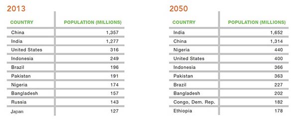
Table 2 was posted bay the www.prb.org organization back in 2013. I’m leaving it in this 3rd edition to illustrate how population estimates are close but are not made because scientists (or anyone we know of) can actually see into the future. These estimates are based on historical data and how actual countries changed or remained constant given the previous trends and national data that scientists used to estimate their future population experiences. All that said, let’s look at new predictions and see if those the same “Ten Most Populated Countries in the World, 2013 and 2050” might remain that way into the year 2010.
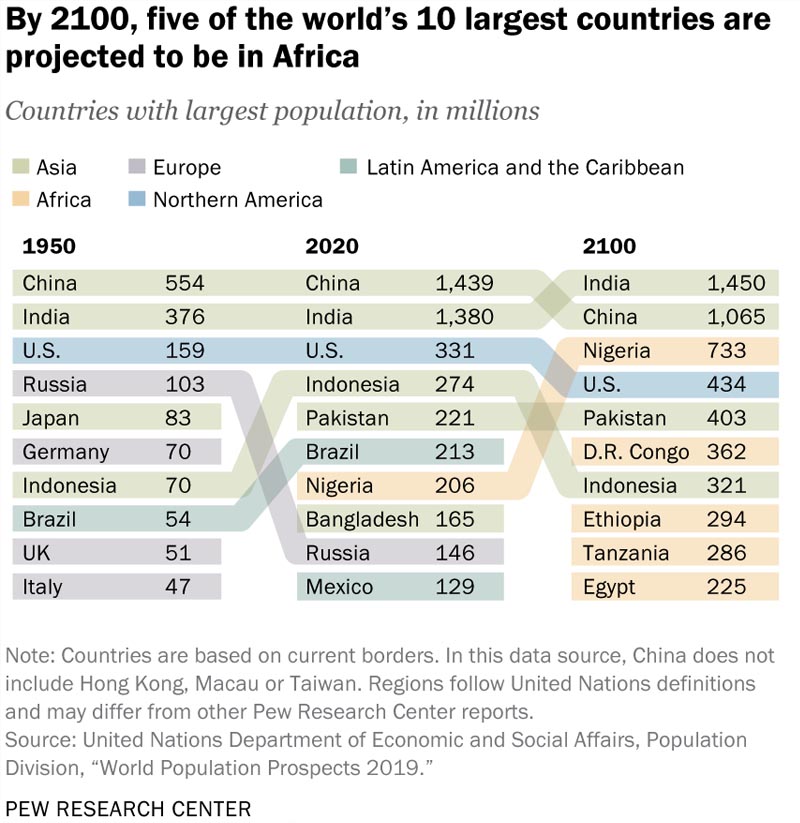
To do this we will look at Table 3 which was retrieved from another PewResearch report. As of 2020 data, China was still larger than India but by the year, 2100 India will be the largest most populated country in the world. Nigeria was 7th largest back in 2013 and 2020, was estimated to become 3rd largest by both 2050 and 2100, far surpassing the United States with 299 million more people than the U.S. will have. A country making dramatic growth in its population and in its estimated rise up the scale is the Democratic Republic of the Congo, it was supposed to be 9th largest by 2050 and by 2100 it will be the 6th largest. The U.S. and Pakistan remain in their predicted places at 4ht and 5th respectively.
Still, Japan disappears completely from the top 10 largest country list between 2013 and 2020. Brazil which was 5th largest in 2013 and estimated to be 7th largest by 2050; is completely off the list by 2100. Russia follows the same pattern. So, we can conclude that these estimates are fairly accurate. Demographers tend to run computer algorithms (statistical formulas) on data and can incorporate those into statistical prediction models with low, medium, and high estimates. They tend to report the safest of those estimates which is the medium ones. You might also wonder why certain countries have such dramatic shifts in their population sizes. The answer goes back to the basic demographic forula of (Births-Deaths) +/- (In- Out Migration) in a given population from one year to the next year. It really is that simple.
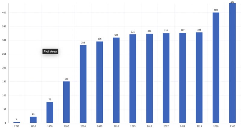
Figure 1 shows the US population for selected years between 1790 (the 1st US Census) and 2013 (estimated by the US Census Bureau). At its first official Census, the US had more than 4 million inhabitants, but it failed to count Natives, Blacks, and other racial groups. In the 230 years represented in Figure 1, you can see that the US population has increased over 80 times since its 1790 count-this taking into consideration all the births, all the deaths, and all the in-out migration. The US continues to grow in our day and will in coming years.
Notice the rapid growth between 1790 when there were roughly 3.9 million to 1900 when there were about 76 million. Between 1900 and 1950 the U.S. population almost doubled from 76 million to about 151 million. How did that massive growth take place in only 50 years? Very high birth and immigration rates and simultaneously increasing life expectancies. The birth rates have plummeted to historical lows while the recent immigration numbers have been limited by Presidential order since 2016. In fact a U.S. Census report of 2019 stated that growth has dramatically declined in the last decade ending in December 2019 (see US Census, Johnson, S. L. (30 Dec. 2019) retrieved 20 July 2020 from SOURCE).
Table 3. PewResearch World Top 10 Countries 1950, 2020, and 2100*
As you look at those predicted 2050 and 2100 numbers, you might wonder as I do what the ongoing federal reduction in immigrants being allowed into the U.S. each year; the very low birth rates; and even the deaths cause by COVID 19 Pandemic 2020 and 2021 will might do as far as changing estimated future U.S. Population Trends.
Figure 1. Estimated Population of the United States for Selected Years 1790-2019 with estimates for 2050 and 2100*
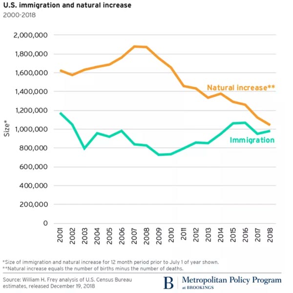
Brookings Institute is a non-profit research organization that releases various policy reports specific to the United States and the rest of the world. A Report released in 2018 shows the 2001 to 2018 Natural Increase and Net Migration trends for the U.S. Figure 2 shows these trends which can also allow us to see why the U.S. has a slowing growth rate. Natural Increase of courses is the number of Births that exceeds the number of deaths in a given year. In the U.S. birth rates peaked one last time in 2007 at 2.21 births per woman. In 2018 it was announced that the U.S. hit the lowest level of birth in its recorded history at only 1.73 and 2019 looked to be even lower. If a society like the U.S. has too low of fertility rates, typically it allows for more immigrants to enter the country legally so they can work the jobs and pay taxes, etc. You will see that worldwide there are many nations with such low fertility it has created economic crises and severe burdens on the retirement systems of their respective countries.
Figure 2. Brookings Institute Trends of Natural Increase and Net Migration for 2001 to 2018*
Let's look at the birth rates for the US compared to the current highest birth rate state, Utah, and the current lowest birth rate state, Vermont, between the years 1991-2009. But, first we need to define a few specific rates. The Crude Birth Rate (CBR) is the number of live births per 1,000 people living in the population. It's called crude because it ignores age-specific risks of getting pregnant. There are two U.S. States that bring some light to the extreme CBR’s that can be found in various states. Vermont has had the lowest CBRs for many years and that included: only 8.7 births/1,000 population in 2018; 10.4/1,000 in 2006; and 12.9/1,000 in 1993*. Contrast that to the state with the ongoing highest CBR, Utah which had 14.9 births/1,000 population in 2018; 14.2/1,000 in 2006; and 19.6/1,000 in 1993* (*Retrieved 4 June, 2014 from Martin JA, Hamilton BE, Sutton PD, et al. Births: Final data for 2007-2009. National vital statistics reports; vol 59-62. Hyattsville, MD: National Center for Health Statistics. 2010. SOURCE and retrieved 21 July 2020 from. Births: Final data for 2007-2018. National vital statistics reports; vol 59-68. Hyattsville, MD: National Center for Health Statistics. 2007-2018. SOURCE and Vermont Vital Stats 2016 from SOURCE) . As mentioned above, having high enough birth rates truly matter because of a state or country’s need to have available workers to perform the work, pay the taxes, and spend their wages. We will revisit Utah’s high birth rates below and the economy-supporting role it has proven to play in recent decades.
There are other ways to measure births within populations. Demographers use slightly different terminology than the average person when describing a woman's ability to get pregnant. True Rate- is the "Number of events/ Number" at risk of the event. In other words, the Crude Birth Rate is not a true rate because it includes children, males, and the elderly in the denominator of "1,000 population." To demographers, Fertility is a measure of the number of children born to a woman.
Total Fertility Rate is the total number of children ever born to a woman calculated both individually and at the societal level. Fecundity is the physiological ability to conceive or give birth to children. Utah has a 115+ years of having higher TFRs than most states and than the entire United States. Figure 3 shows a graphic from the University of Utah’s Gardner Policy Institute (October, 2017). This has contributed to some state circumstances that have both pros and cons in them. One of the cons has to do with taxes for education expenses. Utah is reported to have had a 2019 population of only 3,205,958 with about 36.7 percent of its entire population being under age 18 and another 29.0 percent ages 5-18 who have their public education provided out of tax revenues (retrieved 21 July 2020 from US Census Quick Facts Utah at SOURCE ). Utah has a higher than average tax rate compared to the other 49 states.
Some of the pros include education as well. Utah spends less per pupil than many other states, yet has a higher than average high school and bachelor’s degree graduation rate than the U.S. (HS 92.0%-UT & 87.7%-U.S.; Bach. 33.3%-UT & 31.5%-U.S.). Utah’s median 2018 income was $68,374 and the U.S. was only $60,293. Utah’s population grew 16.0 percent between 2010 and 2019 and the U.S.’s only grew 6.3 percent. Other favorable comparisons include Utah has a lower percent in poverty and a slightly higher percent of people ages 16 and older in the labor force. Why, with so many children and with a heavy tax burden for public education does Utah have better economic measures?
Utah has a corporation-friendly, right to work state policy with a high economic draw, leading to lots of people moving into the state (we talk about migration “Pull Factors” more below). The list of major corporations setting up online and call-based serviced centers is also massive and expanding every year. Interestingly Utah has been rated as among the most stable economies, with some of the strongest economic expansion predictions, and some of the highest quality of life measures by a variety of organizations and thinktanks. Having more than enough children matters, but the point here is that many other population and economy-sustaining factors need to be in place for that to show up as it did here in the Utah comparative reports.
Figure 3. Utah and U.S. Total Fertility Rates 1900-2015*

More Developed Nations are nations with comparably higher wealth than most countries of the world including: Western Europe; Canada, United States, Japan, New Zealand, and Australia.
Less Developed Nations are nations located near to or south of the Equator which have less wealth and more of the world's population including: Africa, India, Central and South America, most island nations, and most of Asia (Excluding China). Until November, 2013 China had the most strict fertility policy in the world and it is often excluded from the rest of Asia in most official reports SOURCE.
Figure 4 shows that according to recent data reported by the Population Reference Bureau (PRB), Africa is the "birth hot spot" of the world and has been since about 1950
Figure 4. Total Fertility Rate Map of World, 2019 with TFR Rates color-coded Country-by-Country*
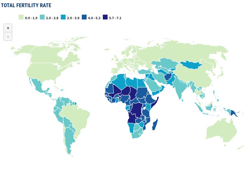
There is a demography principle which states that it requires a minimum TFR of 2.1 for the population to replace the man and woman who made the children and a TFR of 2.3 to begin to expand the population. The U.S. with a TFR of about 1.702 in 2019 is well below the replacement level. Notice the light green shades of the map in Figure 4 that shows the world’s wealthiest nations in the “green rang of (TFR between 0.9-1.9 TFR). The PRB reported that in 2020 91 countries had below replacement level TFRs. It also reported that by 2050 there will be 38 countries that have had seen “population shrinking” to the point that their overall population numbers will be lower than they are in 2020.
The PRB 2020 report also showed that in 2020 the “More Developed” countries accounted for only 1.272 billion people (17%) while the “Less Developed” accounted for 6.501 billion people (83%). China, Brazil, Russia, and India referred to as being “BRIC” countries (https://en.wikipedia.org/wiki/BRIC ). These were named “BRIC” because of their unique expanding economic expansion that made them fit more closes to one another than they did to the “More Developed or “Less Developed” categories. Among the 4 countries, 3 are in the light green shaded area and only India has a TFR above replacement level so their population is growing fastest. In 2020 the BRIC County populations were: Brazil 212 million people (3.0%); Russia 147 million people (2.0%); India 1,400 billion people (18.0%); and China 1,402 billion people (18.0%).
Africa had a combined 1,338 billion people or (18.0%) of world’s 2020 total population. has all but 5 countries in the zones above and well above replacement levels. This includes: 8 in the 2.9-3.9 TFR range; 23 in the 4.0-5.3 TFR range; and 6 in the 5.7-7.3 TFR range. In 2019 TFRs included: Mali at 6.3; Niger 7.1; Chad 5.9; Benin 5.7; Somolia 6.0; Angola 6.2; and finally, Democratic Republic of the Congo at 6.2 TFRs. The massive future growth of the world is happening in the poorest regions of the world. These countries will continue to grow and it is hoped by many that their economic prosperity rises to support better quality of life for its citizens with that growth.
Theories and Principles
Doubling Time is the time required for a population to double if the current growth rate continues. To calculate the doubling time you simply divide 70 by the current growth rate of the country and that yields the number of years required for the double. The world's population should double in 71 years. Table 4 shows the growth rates and doubling times of selected countries and world regions. At their current growth rate, the wealthiest more developed portions of the world will take about 539 years to double in size. The PRB Population Data Sheet estimates that 25 countries will double their population numbers between 2020 and 2050 (SOURCE). The Maldives and Japan have some of the lowest growth rates and like all of Western Europe their populations are shrinking and cannot have a doubling time be calculated.
Table 4. Growth rates and Doubling Times for Selected Countries 2019*
| Country or Region | Growth Rate | Doubling Time in Years |
|---|---|---|
| More developed | 0.13 | 539 |
| Less Developed | 1.14 | 61 |
| Africa | 2.37 | 30 |
| Latin America/Caribbean | 0.84 | 83 |
| Asia (Excluding China) | .77 | 91 |
| China | 0.26 | 269 |
| Europe | -0.05 | Shrinking, can't calculate |
| India | .99 | 71 |
| Ukraine | -0.65 | Shrinking, can't calculate |
| North America | 0.59 | 119 |
| Russian Federation | -0.11 | Can't Calculate |
| Japan | -0.4 | Can't Calculate |
| World | .98 | 71 |
Another demography concept is called Zero Population Growth occurs when a population neither shrinks nor expands from year to year. Based on other factors in the demographic equation, including death and migration, you can see various results. To understand why some countries have higher or lower rates, you must first understand some theoretical backgrounds.
There are two distinct perspectives that relate to births in a population. Antinatalist is a perspective which opposes childbearing. Pronatalist is a perspective which promotes birth and increased population. Antinatalists oppose birth, support contraceptive, abortions, and sterilization along with the education of women. Educating a woman is the most effective way of lowering her fertility. Pronatalists support birth, large families, extended families, and the governmental support of childbearing.
The U.S. had an antinatalist perspective until President Ronald Reagan changed the U.S. foreign policy in 1984, at the population conference held in Mexico City. President Bill Clinton eventually changed it back to antinatalist. George W. Bush changed it to pronatalist and President Barack Obama changed it back to antinatalist again. After a U.S. President chooses the nation's perspective, international and local policies come into effect by supporting pro-or antinatalist programs.
The first Antinatalist was Thomas Malthus (1766-1834). He was a Reverend and English scholar from the United Kingdom, who took a strong stance against the unprepared parents of his day. To him "prepared parents" had established their education and livelihood, their household, and their marriage before they considered getting pregnant. Keep in mind that there were very few effective methods of birth control at this time, so Malthus came across as a hardliner against parenting. He published half a dozen editions of his work, An Essay on the Principles of Population (1798-1830) which were extremely controversial, yet carefully read by many influential people of his day.
For Malthus the problem was that populations grew more rapidly than the production of food, which to him was the cause of many social ills in the new industrial societies of Europe. See Figure 5 He declared that no sex before marriage, forced sterilization, and criminal treatment of unprepared parents would be the new conservative norm.
History has shown that famines, wars, plagues, and other terrible conditions do occur. The antinatalists blame too many babies and people, too much destruction of the natural environment, the existence of the traditional family, and capitalistic profit-seeking at the cost of global well-being. A contemporary antinatalist named Paul Ehrlich wrote the book, The Population Bomb in 1968 (Ballantine Books). He is considered to be a Neo-Malthusian, or an antinatalist who agrees with Malthus, but rejects his conservative and religious proscriptions. Much of the governmental organizations in the world today are antinatalistic.
Figure 5. The Malthus Graph Depicting the Shortage That Occurs When Population Growth Exceeds Food Production Capacity.

The pronatalists point out that there is plenty of food in the world and always has been. They blame political and social mismanagement for the social ills, not the high birth rates. One 2013 report highlighted how on a global scale, we make plenty of food to feed 10 billion people (See Better Meets Reality article “Is there currently enough food in the world to feed everybody?” 10, May, 2020 retrieved 21 July 2020 from SOURCE). In 2013 a journalist suggested we simply turn the food surplus available into biofuel (See Gimenez, E.H. (2012) “We Already Grow Enough Food For 10 Billion People -- and Still Can't End Hunger” http://www.huffingtonpost.com/eric-holt-gimenez/world-hunger_b_1463429.html retrieved 5 June 2014). Agriculture wears down the environment in its current technological approaches. These could be improved and could become much more environment-friendly and still remain profitable.
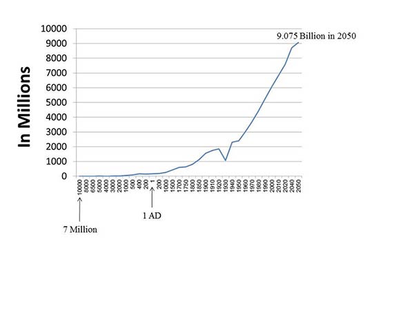
Look at Figure 6 4 below to see the estimated world population from 10,000 BC to 2050 AD (these are only estimated since there were very few government statistics prior to the industrial revolution). You can clearly see that there were millions and millions of people on the earth throughout the history of the world. Pronatalists argue that for the most part, civilizations ate, lived, and thrived and still do today. When they starved it was typically some political or natural disaster factor not a Malthusian shortage that explained it. Besides, they argue, Malthus underestimated the enormous gains in medical, agricultural, environmental, political, and other sciences that have given this world the highest standard of living it has ever known. Do you feel a bit confused? Truth is that there is ample evidence to support both antinatalist's and pronatalist's perspectives.
The bottom line is that the World Health Organization, World Bank, United Nations, United States, and all of the other more developed nations of the world are Neo-Malthusian/ Antinatalistic to some degree or another. While the people of the less developed regions of the world live a pronatalist's lifestyle and thereby are mainly responsible for the rapidly increasing growth of births into the world population. Pronatalist point out that in all of recorded history, there have existed many more populations that adequately provided enough food, water, shelter etc. for their society members. Besides, it is estimated that there have been more than 108 billion people who ever lived on this earth (see PRB, Kaneda, T. & Haub, C. (23 Jan., 2020) “How Many People Have Ever Lived on Earth?” retrieved 22 July 2020 from https://www.prb.org/howmanypeoplehaveeverlivedonearth/ ). This article describes in brief detail how such an estimate was derived. They also point out that up until the decades since the Industrial Revolution, lives were very short in comparison to how long we live today.
Figure 6. World Population Estimates in Millions for 10,000 BC to 2050 AD*
Pronatalists also argue for more births although their calls for increased fertility and increased support for families raising more children, fall on many who are adamantly opposed to promoting more children anywhere for any population—The Antinatalists view is predominant in wealthier nations, more powerful banks, international organizations, and most importantly policy makers. Still, the half-century extremely successful efforts to reduce fertility according to antinatalist philosophy as created some challenging economic circumstances for many countries.
China is perhaps the most intense example of the dangers of “over-restricting” fertility. The extremely strict “One-Child-Only-Policy” China passed in 1979 created some demographically challenging current and future circumstances for China (see Wikipedia page at https://en.wikipedia.org/wiki/One-child_policy ). In the past, Chinese elderly were cared for in what was commonly a “4-2-2 home.” But, in the last 40+ years a challenging problem emerged called the “4-2-1” crisis. China’s life expectancy has been on the rise. Typically, the retired elderly (a Husband and wife of each adult married child=4) move in the same home with their son and his wife (they=2). Then as the grandchild is born, raised and marries (Grandchild + Spouse=2) they became default caregivers to their aging parents and all of them would have been caregivers to their elderly grandparents. But today the 4 grandparents move into their married 2 adult’s home and only have 1 grandchild and it has become a significant “4-2-1” problem which is getting worse in coming years.
Here is how. After the most severe antinatalist policy ever enacted by a modern government in modern times was put into place, female babies became less and less common. Many expecting parents had an early ultrasound performed and often aborted female fetuses in hopes of having their 1 allowable child be a male. There are as many as 30 million more males in China as of 2020 who have no female their age to marry. There is or was an animation of population pyramids for China on the Wikipedia page linked above (directly linked here https://en.wikipedia.org/wiki/One-child_policy#/media/File:China_Pop_Pyramid_Forecast.gif ). Even though China legalized more than 1 child starting in 2016, couples are not very motivated to have another. One award winning journalist Mei Fong wrote a book addressing the many Chinese crises occurring from that One Child Only Policy. She wrote it after the policy reversal passed in 2015 and in-place in 2016. Basically, she stated:
"The reason China is doing this right now is because they have too many men, too many old people, and too few young people. They have this huge crushing demographic crisis as a result of the one-child policy. And if people don't start having more children, they're going to have a vastly diminished workforce to support a huge aging population."[75] China's ratio is about five working adults to one retiree; the huge retiree community must be supported, and that will dampen future growth, according to Fong (Fong, M. “One Child: The Story of China's Most Radical Experiment” by Houghton Mifflin Harcourt (January 5, 2016), pages 272) and see Wikipedia page at SOURCE.”
Pronatalists use the China “4-2-1” crisis as evidence of strict antinatalism in China and in many other countries (Past and ongoing) as reasons to find a balance and promote more births with more support for families raising children. Much more could be written and stated on both antinatalists and pronatalist claims and their consequences. Because of antinatalists policies since World War II, fewer people were born and fewer children are in the labor force. Because of generally increasing life expectancies worldwide, more elderly are in need of care and more governments are in need of more workers to pay retirement tax which is used to support the currently retired elderly in their respective societies.
It is true that fewer births have occurred since WWII than otherwise would have. But, there are many countries with very high birth rates and others with very high immigration rates. Look at Table 5 below to see how fast the US and World are growing. The U.S. only comprises a very small portion of the World’s overall population. If you can hold your breath for about a full 47 seconds, in the U.S. almost 6 people will be. Born and almost 4 people will have died. If you can hold your breath for about a full 47 seconds, in the World about 162 people will be Born and almost 44 people will have died. Staggering isn’t it!?
Table 7. United States and World Population Clocks 2020*.
| Population Changes: | United States | World |
|---|---|---|
| 1 Birth per: | 8 seconds | 0.02 seconds |
| 1 Death per: | 12 seconds | 0.07 seconds |
| 10 Net Person Increase | 2:28 minutes | 0:18 seconds |
Let’s shift now to the second event in the demographic formula, death Death is the termination of the body, its systems, and brain activity in an irreversible way. Death is a part of life. All of us are at risk of dying, but not all of us share the same risks. To be born around or below the equator, female, tribal, and non-white represents risk factors not shared by those born in the US, female, suburban, and non-white (think about Max Weber's Life Chances). In fact, in many cases migrants to the US raise their life expectancies higher than they would have been back in their less developed home countries.
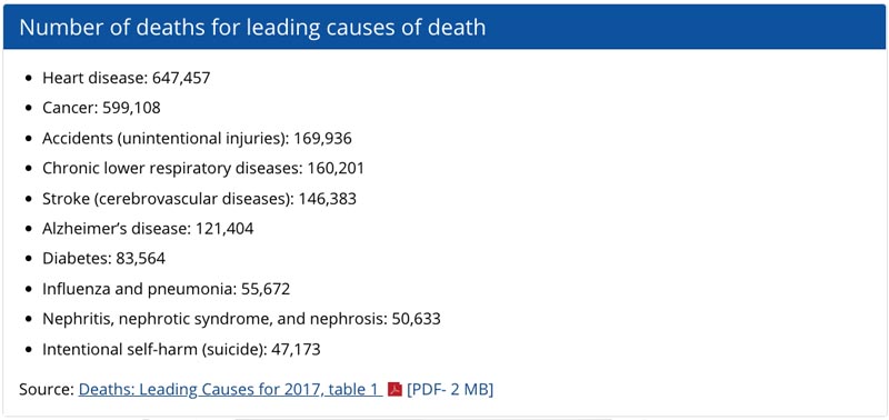
Figure 7 shows the top 10 causes of death in the US for the year 2017. Even though this 3rd edition is being written in 2020, the Centers for Disease Control (CDC) takes 1-2 years to confirm final statistics. Heart disease is and has been the number 1 killer in the U.S. for decades. Yet, more and more people are dying from Cancer in the U.S. In 2018 an undergraduate student name Michael Harding (attending medical school as of 2020) and his BYU-Provo faculty research mentors studied state-by-state causes of death and found that between 1999 and 2016, cancer was the most common cause of death in 19 of the 50 states and the trend is shifting slowly toward cancer becoming the most common cause of death in the U.S. (see aHarding MC, Sloan CD, Merrill RM, Harding TM, Thacker BJ, Thacker EL. Transitions From Heart Disease to Cancer as the Leading Cause of Death in US States, 1999–2016. Prev Chronic Dis 2018;15:180151. DOI: http://dx.doi.org/10.5888/pcd15.180151 and bCenters for Disease Control and Prevention. National Center for Health Statistics. Underlying cause of death 1999–2016 on CDC WONDER online database. Released December 2017. Multiple cause of death files, 1999–2016. SOURCE
Heart disease and cancer have led world-wide causes of death for decades as well. The top 4 causes are also highly correlated with tobacco use. And since smoking is becoming much more common in less developed countries, cancer is predicted to become the number 1 cause of death world-wide The World Health Organization (WHO) stated that 1.3 billion people smoked tobacco in the world as of 2020 and that it contributes to 80 percent of smokers deaths; killing about 7 million smokers and about 1.2 million family members and friends who breath the second-hand smoke after it is exhaled (Retrieved 21 July 2020 from SOURCE
In less developed nations there are other significant causes of death that we don't worry about here in the U.S. (at least not as much), including:. Malaria, AIDS, accidents, maternal death, diarrhea, Measles, Mumps, Rubella, local exotic diseases, and other infectious and parasitic diseases. In fact, AIDS or Acquired Immune Deficiency Syndrome is much more common in Africa and parts of Asia than in any other region of the world. AIDS is considered an ongoing pandemic. By far, AIDS is spread heterosexually more than homosexually. Heterosexuality is sex between a man and woman and is the most common way of transmitting AIDS throughout the world. Scientists from many different disciplines study and track diseases such as AIDS, SARS, COVID 19 and the others.
Epidemiology is the scientific study of diseases, their transmission, and their management. The US has the most advanced disease tracking and epidemiological management system, which is found at the Center for Disease Control, Atlanta, Georgia . On this website you can click on "Traveler's Alerts" and choose a country to see if there are any disease concerns for tourists (SOURCE). Go to the website, pick a country and read up about their current disease concerns and shots you should get in preparation to visit another country.
Figure 7. Top 10 Major Causes of Death in the United States 2017*
Because we have so many visiting between countries and migrating to and from the US, it is in the CDC's best interest to be globally concerned and involved. The CDC concerns itself with all diseases in every country, but especially extremely deadly diseases such as Ebola, SARS, COVID 19, AIDS, and others. In 2014, the CDC had American and other medical professional who had been stricken with the Ebola virus, fly to Atlanta, where they were treated under extremely strict clinical circumstances (SOURCE). More recently the CDC play a huge role in tracking infection and death rates, gathering research and experts, and making national recommendations to state and national leaders on how to manage and protect their populations from COVID 19 (SOURCE).
Demographers also concern themselves with a number of death-related rates. The Crude Death Rate is the number of deaths in a given population per 1,000 people living in that population. Again, this is not a true rate because not all members of society have the same risks of dying (IE: 30 year-olds not at the same risks of death as 80 year-olds). The Infant Mortality Rate is the number of infant deaths per 1,000 live births. The CDR and IMR vary greatly between countries and regions.
It should no longer surprise you to discover that the poorer regions of the world have the worst rates in almost all demographic measures (see Table 6). Typically the lower the GINI Index score for a country, the high the death rates. To summarize these and other findings in this chapter you can conclude that: 1) more babies are born in developing nations of the world than in the developed ones; 2) more infants and other people die sooner in the less developed regions of the world than in the developed ones; and 3) most of the world's future population growth will come from the less developed regions of the world. The CIA Factbook reported that Afghanistan had the worst IMR in 2017 with 110.6 newborns dying for every 1,000 live births (See https://www.cia.gov/library/publications/the-world-factbook/rankorder/2091rank.html ). That means about 11 out over every 100 babies die there before their first birthday. In 2017, Monaco (only 1.8 and Japan (2.0) had the lowest IMR’s of any country in the world.
Table 6. Crude Death Rates and Infant Mortality Rates for Selected Countries 2019*
| Country | Crude Death Rate CDR | Infant Mortality Rates IMR |
|---|---|---|
| More Developed | 10 | 4 |
| Less Developed | 7 | 37 |
| Africa | 8 | 49 |
| North America | 8 | 6 |
| Latin America | 6 | 14 |
| Asia (without China) | 6 | 18 |
| China | 7 | 9 |
| Europe | 11 | 4 |
| India | 6 | 33 |
| Japan | 11 | 1.9 |
| World | 8 | 31 |
Why is the world's population growing so rapidly in regions with the fewest resources? Part of the answer to this question is found in the Demographic Transition Theory which claims that populations go through 3 distinct stages that correspond to the onset of the Industrial Revolution with regard to changes in birth and death rates. Look at Figure 8 below to see the three stages of this theory.
Figure 8. Diagram of the Demographic Transition Theory
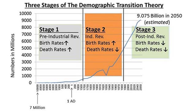
As you can see, the Demographic Transition Theory has three distinct stages. Stage 1, the Pre-Industrial Revolution Stage, encompassed the world's population up until about 1700 AD. Much of the world's population grew very slowly up to that point. That is all it could do because the high birth rates were offset by the high death rates (lots of people were born and died relatively quickly).

Stage 2 or the Industrial Revolution Stage saw the decline in death rates while birth rates remained high. This is the perfect demographic storm for population growth and this coincides with the rapid growth of populations in Western Civilizations (lots of people were born and they died later in life). The Post-Industrial Revolution, Stage 3 came with the technical and computer chip revolution that raised the standard of living so much that death rates remained low while birth rates dropped (fewer people being born and they die even later in life).
The Demographic Transition theory did describe what happened in Western Europe, Canada, The United States, Australia, and Japan. But, it does not fit so neatly in the less developed countries of the world. They never really had an Industrial Revolution, they only benefited from the European one. They never really moved fully into the technological and computer chip revolution, it spilled over gradually. Because of post-World War II medical delivery systems and because of international aid, the less developed countries of the world have had their death rates decline and their life expectancy has extended. But, their birth rates remain relatively high (as you have already read above). This is why so much of the world's future population growth will come from Africa, Latin America, Parts of Asia, and other island nations.
Very concerned antinatalistic efforts have been implemented in the less developed countries of the world over the last 40 years. Scientists can measure a gradual lowering of the birth rates as a direct result from it. But, keep in mind that however they got there, the people of less developed regions of the world are still in Stage 2 and have explosive population trends that will continue for the next 40-50 years.
Population Structures
Before we discuss migration, let's talk about the population from an age-sex structural point of view. Every population/society can be compared by an age-sex structural approach called the Population Pyramid, or the graphic representation of specified 5-year age groups within a population and by being males or females.
A population pyramid can tell you some interesting things about the age-sex structure of a country for a specific year.. Pyramids show males and females on opposite sides, and by 5-year age groupings. Some show the numbers and others show the percentages. Look at Figure 9 to see the 2018 population pyramids of: Nigeria, The United States, and Japan. Japan’s 2018 pyramid illustrates a “Negative Growth Pyramid”=a population pyramid for a country with very low birth rates and very high life expectancies. Japan’s resembles a tree that has had the lower part of it’s trunk chewed off or eroded in someway. The Nigeria pyramid illustrates the “Rapid Growth Pyramid”=a country with relatively high birth rates and relative high death rates (or low life expectancies). Finally, the U.S. pyramid illustrates a “Slow Growth Pyramid”=a pyramid with moderate birth rates or low birth rates and high immigration rates, and moderately high life expectancies. The U.S. is growing slowly and should continue to do so if immigration returns to pre-2016 levels (or does not drop much lower than 2019 levels) and death rates remain low.
The Japan 2018 pyramid shows smaller percentages of child and young adult aged people in comparison to middle and older adult percentages. The Nigerian pyramid shows a very wide base representing decades of high birth rates and it can show you a very narrow top, representing high death rates for decades. Finally if you look carefully at the U.S. pyramid, you can see it is beginning to show the same narrowing of children-aged people as Japan has (just not as intensely). Near the top you can see that there are more elderly women than elderly men.
Figure 9. The 2018 Population Pyramids of: Nigeria, The United States, and Japan*
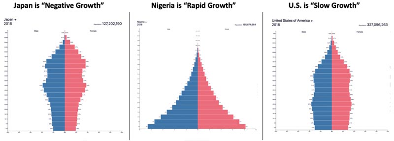
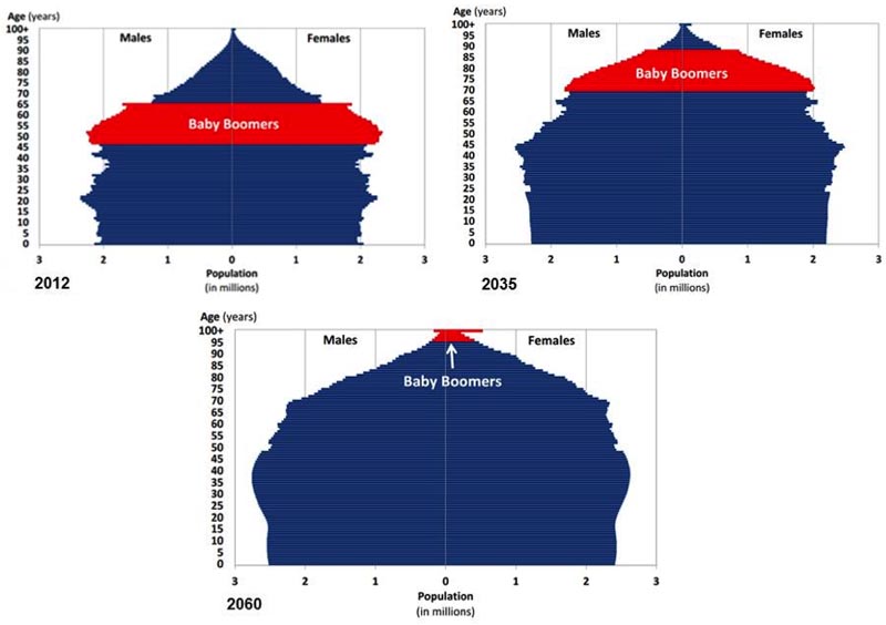
Figure 10 shows you U.S. Pyramids that highlight the gradual disappearance of the Baby Boomers. You can see how gradually over the years 2012, 2035, and 2060 .The oldest Baby Boomer would have to be 114 years old to still be alive. The Youngest Baby Boomer would be 96. These pyramids also show that there will be a similar proportion of males and females. Because birth rates are low and are remaining that way, you see a widening look as the pyramid portrays the population more as a column than a pyramid. Population pyramids can actually take on any number of shapes. But the true pyramid shape comes only when there are high birth rates (a wider pyramid in the younger ages) and people die soon (a narrower pyramid in the older years at the top of the pyramid).
Figure 10 United States Population Projection Pyramids: 2012, 2035, and 2060*
As this chapter draws to a close, we need to discuss how demographic trends impact the greater likelihood of epidemics and or pandemics like COVID 19 and like future pandemics that will likely occur. An Epidemic=a large spreading of a disease among people living in a given population within a short period of time. A Pandemic=is a large spread of a disease across geographical or political borders in a short period of time. The WHO had made a decree to cease using the word “Pandemic” because it was defined to vaguely. They revewrted back to it in the case of COVID 19.
A PRB Report spoke to these trends (see PRB, Kaneda, T. & Greenbaum, C. (13 April, 2020). “How Demographic Changes Make Us More Vulnerable to Pandemics Like the Coronavirus” retrieved 21 July 2020 from https://www.prb.org/how-demographic-changes-make-us-more-vulnerable-to-pandemics-like-the-coronavirus/ ). This intriguing article shows how we are better prepared for this COVID 19 Pandemic than we were for the 1918 “Spanish Flu” but that we should not consider COVID 19 to be the last pandemic the world ever has to deal with. Why? The article points out some demographic patterns such as 4.3 nillion passengers flying in planes back in 2018; about 1.8 billion tourist visiting another country; as of 7 April, 2020 there were 1.5 million confirmed cases of COVID 18 in 183 different countries-only 5 months after the first case in China emerged! We have more and more large urban centers such as New York city which unfortunately is the epicenter of the cases and deaths from this pandemic.
As of 2020 about 56 percent of the world’s population was classified as living in urban areas. There were 548 cities with 1 million or more inhabitants and as of 2018 there were 33 cities with 10 million or more inhabitants. New York is a megacity! Humans expanding civilization come into more contact with a variety of animals increasing the odds of another animal-born epidemic or pandemic such as SARS, H1N1, COVID 19, or other recent epidemic or pandemic (see Wikipedia page at https://en.wikipedia.org/wiki/List_of_epidemics ). Finally, there is an ever increasing percentage of the world’s population that is 60 or older. That means those who have been most impacted by the last few epidemics and pandemics are becoming increasingly a great portion of our populations worldwide. The Wikipedia page above identifies 30 + epidemics and or pandemics that have striken countries or regions just since 2010. The elderly, children and those with existing medical conditions die more from epidemics and pandemics (SOURCE).
Of course we will also discuss the last portion of the demographic formula, in and out-Migration. If someone moves out of your country they are called emigrants. Emigration is the departure from your country of origin to reside in another. Once there, they'd be considered to be an immigrant. Immigration is the arrival of a foreigner into a country they will reside in and likely become a citizen of on some future date. The US has far more immigrants (arrivals) than emigrants (departures) every year and has a long and steady pattern of in-migration with 50,407,283 million legal immigrants who came to this country by 2015 (see https://en.wikipedia.org/wiki/Immigration_to_the_United_States ). To legally emigrate out of the U.S. and become a citizen of another country, one would have to renounce their citizenship through the U.S. State Department which may only be a 1-3,000 total per year of formal U.S. emmigrants (SOURCE ). Still, there are millions who live as U.S. citizens on a long-term basis in other countries.
Why do people decide to move from one country to another? Demographers consider two very important factors in understanding migration: push and pull. Push Factors are negatives aspects of where you live which make you consider leaving. Pull Factors are positive aspects of another place which draw you to migrate to it. Push factors include wars, famines, political hostility, natural disasters, and other harsh circumstances that create an environment conducive to looking for another place to live. Pull factors include economic prosperity, jobs, food, safety, asylum, and the hope of survival that draws people to move to the desired location. About 1 in 6 people in the US move each year. College students, job seekers, transferees, divorcees, and most recently people needing to live with extended family, because of tough economic times all contribute to the migration process within the United States. As we finish the demography chapter, keep in mind that demography affects everything and everything affects demography.
Between 2012 and 2018 millions of refugees fled their countries towards European countries that would allow them religious freedome; safety away from war and combat; maltreatment of people in their country; and of course pull factors such as economic opportunities and the ability to support their family. A Website has an animation of this refugee pattern which shows illuminated dots that represented roughly 11 refugees fleeing to a new country (see https://www.lucify.com/the-flow-towards-europe/ this company tends to update and the last update I saw as of the date retrieved (22 July 2020) was made 12 November 2018). A few European countries took in many more refugees than others, including Germany (1.61 million); Sweden (364,000); France (402,000); Italy (465,000); Austria (212,000) UK (208,000); Greece (161,000); Switzerland (152,000); an others. The U.S. did not receive any to speak of (as we saw in Figure 2 above the U.S. has a track record of high levels of immigration with significant screenings of candidates to become citizens.
Why might these European nations receive so many with dramatically different languages, cultures, diets, religions, etc.? Part of it must have been benevelance. Another part has a great deal to do with the statement made earlier in this chapter: “Everything in society influences demography and demography conversely influences everything in society.” All of the European nations that took refugees had shrinking populations in 2018. These European nations have had shrinking populations for many years. Their birth rates are very low and have been for many years.
Additional Reading
Using your Internet search browser search out the key words in these questions
- Why are China, Brazil, Russia, and India referred to as being "BRIC" countries (What do they have in common)? LINK
- Why does the conversion of food into fuel as reduce the amount of food available for consumption?
- Look at the hunger and food insecurity LINK and LINK
- China and India Population Pyramids LINK
- Watch US population Pyramid change 1951-2010 LINK
- Why is the population of the world moving toward urban locations more than rural ones? LINK
- Vital Statistics report on Fetal Mortality LINK
- CDC Causes of Death LINK
- Population Reference Bureau (PRB) LINK (look for Population data Sheet)
- PRB on Migration LINK
- PRB on Sex-selection LINK
- American Community Survey Data LINK
- US Real Time Population Clocks LINK
- Population Pyramids for Developing (poorer) countries LINK
- Population Pyramids for Developed (wealthier) countries LINK
- World real Time Population Clocks LINK
About China’s Demography
Why are the demographers warning that China’s population of children will not increase very rapidly even though it is legal to have more than one child now (Since 2013)?
China’s 4-2-1 problem LINK
China has too many bachelors "Already, 41 million bachelors will not have women to marry. If nothing is done to change this trend, Poston noted, by 2020 there will be 55 million extra boys in China." LINK
Gender Bias in China LINK
US Census LINK
Wikipedia Oldest Living People Wikipedia page LINK
Wikipedia List of Known Antinatalist LINK